3. Selecting an Appropriate Form of Media
4. Screen design development 5. On-line Resources
At this point, it is assumed that you have decided on what Instructional Design Model to use based on your content, learning theories, instructional strategies and of course, the learner styles. In any instructional situation, there is usually a message to be communicated. And research has shown us that people have different learning style and different kind of modes and media offers different kinds of learning. For example, its a common thing to choose media for familiarity because the learner can learn more easily from something he knows already. Therefore, not only choosing the right medium or media that will suit best some particular needs becomes important, but also its integration in the learning process become even more important.
Scharamm (1977) quoted in Heinich, Molenda, and Russell (1993) stated that "Motivated students learn from any medium if it is competently used and adapted to their needs. Within its physical limits, any medium can perform any educational task. Whether a student learns more from one medium than another is at least as likely to depend on how the medium is used as on what medium is used."
So now, lets look at the functions of media followed by the modes of stimulus.
One of the basic function of media is to present a stimulus, which in return will evoke a response from the learner. According to Rowntree (1982) many functions exist but she considers the following six to be the more crucial in helping student learning:
"On of the most important roles of media is to serve as a catalyst for change in the whole instructional environment." P26
which means instructors need to be organized in advance, have clear objectives, ect
The medium: the vehicle carrying the stimulus mode.
Human interaction is described here as the communication when two people or more who are responding to each other such as verbal including all spoken words. There's also the non-verbal message which would include: postures, physical, gestures, bodily contact, eye contact, facial expression, non-linguistic utterances. This stimulus would be good for role-playing and simulation games.
Another mode of stimulus is Realia. Realia refers to real things , real events, real animals but also real people when the student observe them, rather than interacting with them.
Some examples of realia are the manipulative Cuisenaire rods, field trips, concerts or theatre. With young students, realia is very important as they explore their environment in many ways before internalizing and using symbols. . So using our senses such as seeing, smelling, hearing, tasting and touching is a good example of realia. Realia can be used very well with other mode as well.
Books, news paper, … are still very easily accessible. One of the advantages with written words is that you can always go back and look at it again if you didn't understand or change it if you're writing, while the spoken words is gone. It gives us control compared to the spoken words. But of course the written word to be valid, one needs to know how to read. Written words can be used in conjunction with other modes like audio, many still visual and others.
This mode is considered to help us to control reality. We can record speech, music, natural sounds and noises. We can play it back. We can edit it, alter it, cut some part, modify it slow it down and repeat it as much as we want. This mode can easily be combined with still pictures, moving images and written symbol.
So its time to begin and to decide
how to choose the appropriate material. Since media need to be chosen
systematically, lets look at this media selection model table (adapted from
Heinich; Molenda; Russell; 1993) to help us to choose the appropriate
format.
| Setting | large or small group, self-instruction |
| learner variables | Reader, non-reader, auditory preference |
| nature of the objectives | Cognitive, affective, motor skill or interpersonal |
| media format | still visuals, motion visuals, printed words or spoken words |
| Does it fulfil the same objectives as you intended? |
| Does it fit the learner characteristics? |
| Is the information accurate? |
| Does it arouse and maintain interest? |
| Does it involve the learner? |
| Is it of acceptable quality? |
| Is it free of bias? |
Visuals
Function
of visuals
Types
of visuals
Audio
Characteristics
of audio
Types
of audio
Motion
Attributes
of motion media
When choosing reading material for your audience, the language has to be at their reading level otherwise they might not understand your message. For example, if the program you are creating is focused for grade 1, you have to make sure the writing is not to difficult for them. Otherwise, you have missed your point and you will loose your audience. This goes for an older audience as well. If the text is too easy or to simplistic for them, they will loose the interest as well. There is many formulas to figure out the reading level of the material. As Price point out, "The basis of the formulas is the idea that reading level is a function of average sentence length, and the number of multiple-syllable words." One common formula is called "Fog Index" and is presented here. The reading level is calculated as such:
Heinich, Molenda and Russell, 1993
advocated that "the primary function of a visual as a communication device is to
serve as a more concrete referent to meaning than the spoken or written word".
In Dale’s cone of experience, visuals are iconic; visuals are a representation
of something real. Still according to Heinich, Molenda and Russell, some
functions of visuals to name a few are: to motivate learners, to increase their
interest, to sustain their attention, to generate emotions. "Reiteration is
another important function of visuals." Visuals can simplify information, make
analogy to a familiar concept and illustrate relationship among elements and/or
concepts.
Types of visuals
Audio media are inexpensive forms of
instruction. They are readily available, simple to use and very good for
non-reading students. They tend to stimulate verbal message more dramatically
than print and can be very versatile. (Heinich; Molenda; Russell; 1993) A
multimedia presentation can be improved dramatically with the use of audio.
According to Whiteside and Whiteside (1997), motivation and channel
redundancy are two reasons for wanting using audio to help to met the
objectives. Let’s look at them rapidly.
There are three main types of audio: speech, music and sound effect. To use them effectively, the designer needs to know about some of the characteristics of each type and the tasks they can accomplish. So lets look at the following table which summarize some characteristics of types of audio and the tasks they can accomplish.
|
|
|
|
|
|
|
|
|
|
|
|
|
|
|
|
|
|
|
|
|
|
|
|
|
|
|
|
|
|
|
|
|
|
|
|
|
|
|
|
|
|
|
|
According to Heinich, Molenda, &
Russell, 1993, "a basic attribute of the moving image is its ability to
manipulate temporal and special perspectives." They continued saying that it
"has important implication for instruction". So lets look at the following
attributes in a bit more details:
This technique helps you to play with spatial perspective. You can look at things very close or very far. It changes our perception of things when we see something usually microscopic enlarged many times or something usually large reduced very small.
With motion media, you can alter continuous time. You can cut a middle section of a motion media sequence, take it out leaving only the beginning and ending and people will fill the gap of what happened. The sequence will still be believable.
With motion media, you can also compress time. You can create an event that normally takes hours to happen and show it in a few minutes of even seconds. This technique is called: time lapse.
Expansion of time means that you can take an event that usually occurs really fast and show it in a pace slower than normal. This technique is called: slow motion.
Animation is a technique to animate objects. The object moves at a short distance at a certain pace. This technique is regaining popularity with its use in instructional packages to "depict complex or rapid processes in simplified form.
According to … obtaining appropriate
materials will generally involve one of these three alternatives: (1) selecting
material that is already available, (2) modifying material that exist already
and (3) designing some new material.
Back
4. Screen design development
Back
Once you know what your program has to do (once your planing is done and you know what to do, you know the approach you will take, fun begins), you need to start storyboarding your interface on paper planning from a functional perspective rather than artistic one.
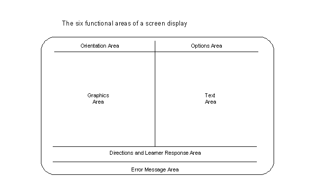
Whatever the approach you decide to choose for your title, there ought to be some basic functions regarding screen design. Heines 1984 (described in Price, 1991) identified five standards of CAI screen components: Orientation information, Directions and learner responses, Error messages, Student options, Text areas and Graphic areas. Let’s look at what they are.
Orientation information and student options have to do with learners being in control of their environment. Orientation information refers to being able to find out where you are in the program. What lesson are you on? How much is left to cover before being finished? How many correct answers are recorded? Student options refers to the learners having options to choose from. It can be via a pull-down menu or perhaps a menu bar that stays on every page. It could include functions like: Quit, Back, Next, Help, Main Menu, sub menus and even choosing to take a quiz.
Directions and learner responses as well as error messages, are related to interaction with the content and with the user interface. Direction means that the learner should be told what to do and not be expected to guess what he is supposed to do. If the learner needs to answer back and the of response is should be clearly stated. It is a very good plan to stay consistent in your design so the learners interact with the learning material instead of the logistic of the program. Some functional areas can grow and shrink to accommodate variations. Error messages are response to inappropriate learner responses. It is different than feedback that explains incorrect answers. The designer must plan error messages at each point in the program where student responses are required.
Text areas and Graphic areas will take up most of the rest of the page. One very important thing to remember regarding screen design is that the printed page is very different. For example, do not overcrowd the screen with rows of text. On paper you can fill the whole page but not on a screen. As a designer, you need to achieve a pleasing and balanced appearance of the functional areas. As we already discussed earlier, visuals are good because they can enhance the presentation, clarify concepts or even add variety to your program making it more interesting to go through. We will be looking at some [propriety] of text in more details further down.
Here is an example on how the six functional areas can be put on the screen.
Functionality can be grouped as well:
Global Functions are those that apply to specific group of screen-such as a Help, Map, Quit, or Return button.
Regional Functions are those that apply to specific groups of screens, but not every screens. These can include certain types of text-input field, "See Also" buttons that only appear on database screen and the like.
Local Functions are those that apply to individual screens. An activity or interactive requirement that only appear once, or that shows up intermittently on a small number of screens that refuse to be easily grouped, would fit this category.
How
people look at visuals
Example
Designing
visual

Regarding the use of colours in instructional communication, Loosmore (1993) stated that "The wonderful world of colour has become available at a reasonable cost." She suggested that "Colour can be used to show qualitative differences in items, to highlight key information, to indicate changes in data, to increase motivation, or to depict real-world accuracy." Here are five points she believe to be important for an effective use of colour in instructional communication: Keep it simple, Keep it clear, Be consistent, Be aware of symbolic associations and Test your colours. Here is a short summary of these five points.
|
|
|
|
| white | black, dark blue | red, yellow-orange |
| light gray | black, blue, green | red |
| medium or dark blue | white, light yellow | pure yellow, red (tinted slightly toward white) |
|
|
|
| red | stop, danger, strength |
| orange | caution, co-operation, change |
| yellow | optimism, cheerfulness, flexibility |
| green | growth, environment, go, balance |
| blue | rest, calm, understanding, patience |
| violet | royalty, confidence, dignity |
| white | purity, honesty, sincerity, cleanliness |
I know you think you understand what I said but what you don’t know is that what you think I said isn’t what I meant.(Price, 1991)
You probably think that this sentence is not very clear in its meaning and not too precise. So when you write something, make sure your message is easily understandable, clear and concise. Take particular care if your readers are young, make sure they can understand the vocabulary you are using.
***Size, font, colour
Young readers also find much easier to read big font letters.
I must say here that, when you create a template, it’s a good idea to think that you are also creating a set of pages that you should be using in a consistent fashion. For example, the screen design layout of a page would be much more different if your are presenting information or if you are giving feedback or asking for a response; but, each page that present information should be consistent with its layout otherwise it will create some confusion with the viewer. Remember, the user should not spend much time to learning and understanding the layout, it should be easy for him/her.
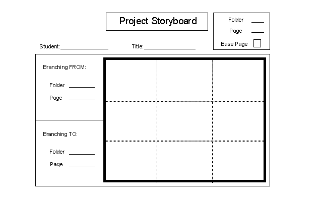
Storyboard
A storyboard is a tool that helps
designer to sketch out the sequences of the instruction. So once you have a good
idea of what you want, you can create your storyboard and see how it flows
together. Remember that the storyboard do not need to be artistic. It is usually
a rough copy of your intention. Lets look at an example.
Back
On-line
Resources
Here is an advanced Instructional Media site talking about philosophy, interface design, page design and much more.
A site that talks about Instructional Design
(Study Guide).
A site that talks about Instructional
Design Methodologies and Techniques.
A site that talks about interface
design.
A site that talks about screen design
standard and general layout.
Here is a site about Storyboard
and Flowcharting to visit.
Another Storyboard site.
A site that talks about
navigation.
A site that talks about choosing
colours.
Research by: Brigitte Lépine
blepine@direct.ca